
A strange thing happens on many SaaS websites.
Visitors leave long before they fully understand what the product actually does.
It’s rarely because the software isn’t good.
More often, the website simply asks people to figure out too much on their own. Features compete for attention, navigation feels like a maze, and important answers are buried beneath layers of content.
SaaS website design has become one of those quiet advantages people only notice when it’s missing. Most visitors don’t arrive ready to book a demo. They compare pricing. Skim feature pages. Open three competitor tabs. Then come back if something stands out.
That’s changing how SaaS websites are built. AI-powered experiences, smarter navigation, and more relevant content are helping answer questions much earlier in the buying process. By the time someone reaches out, they’re often deciding between you and one or two other options, not discovering your product for the first time.
Your Website Isn’t Losing Visitors. It’s Losing Decisions.
Not every visitor leaves because they aren’t interested.
Sometimes, they leave because the next step isn’t obvious.
Think about the questions running through a prospect’s mind.
Can this integrate with our existing tools?
Is it built for a company our size?
How long does implementation take?
If those answers aren’t easy to find, hesitation begins to settle in.
When a SaaS website loses conversions, it’s never because of one major mistake. I’t several moments of uncertainty playing parts.
A cluttered menu. Generic messaging. Five different calls-to-action competing for attention. A homepage that says everything except what the product actually solves.
Visitors won’t write to you and explain and announce they are leaving.
They simply close the tab and continue browsing for better.
That’s why, for modern website design every click is a small decision, and every unanswered question quietly pushes someone closer to making that decision somewhere else.
Modern SaaS Website Design Answers Questions Before Sales Does
Every unanswered question creates a pause.
Enough pauses, and a visitor leaves.
A 2026 SaaS website design is becoming less about beautiful layouts and more about removing uncertainty.
Think about how you research software yourself. You probably don’t want to book a demo just to check a feature or confirm an integration. Most people would rather explore first. AI assistants, interactive FAQs, and self-guided demos make that possible, giving visitors answers when they need them instead of sending them into a maze of documentation.
The rest comes down to the small details. Better UI UX for SaaS and thoughtful SaaS landing page design don’t shout for attention. They quietly remove the tiny annoyances that make people abandon a website before they’ve even finished evaluating the product.
The best SaaS websites don’t wait for a sales conversation to begin.
They start answering questions the moment someone arrives.
| People visit your website to decide if your product is worth their time. Make that decision as easy as possible. Explore Our Website Development Services |
The Fastest Website Isn’t Always the One That Converts
Website speed still matters, however, it isn’t measured only in seconds.
It’s all about how quickly visitors can understand your product.
For instance, platforms like Calendly, Notion, or Slack don’t simply load quickly. What they also do is make information easy to find.
Navigation feels predictable.
Messaging is focused.
Every page guides visitors toward the next logical step instead of overwhelming them with choices.
That’s the difference between technical speed and cognitive speed.
A modern responsive SaaS website should reduce the number of decisions visitors have to make. When pricing, integrations, and product details are within easy reach, visitors spend less time piecing things together and more time deciding whether your software deserves a closer look.
Always remember, the less time visitors spend figuring out your website, the more tim they spend understanding your product.
Great SaaS Website Design Feels Different in 2026
Open a modern SaaS website today, and you’ll notice something subtle.
You’re no longer expected to figure everything out yourself.
A founder exploring pricing has different questions than an enterprise buyer reviewing vendors. One may want an ROI calculator. The other is probably looking for customer stories or implementation details. AI assistants and better search experiences help people reach those answers without digging through endless menus.
It’s not about packing in more features.
It’s about making good information easier to find when people need it.
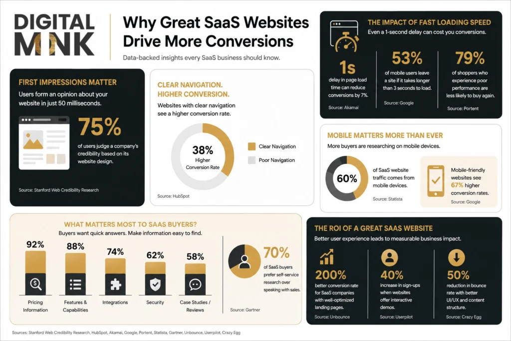
| What’s Becoming Standard? ✅ AI answering simple product questions before sales gets involved. ✅ Trying an ROI calculator before looking at the pricing page. ✅ Seeing different content depending on whether you’re a startup or an enterprise team. ✅ A chance to explore the product before anyone asks you to book a demo. The next generation of SaaS website design won’t just showcase products. It will help users discover the right solution faster than ever. |
Your Next Improvement Starts With Your Last Visitor
Launching a website isn’t the finish line.
It’s the starting point.
The best-performing SaaS websites are constantly learning from the people using them.
Numbers tell you where people leave. Watching real sessions usually explains why. Heatmaps highlight what’s catching attention, while A/B testing helps separate good ideas from the ones that only looked good on paper.
Rarely does SaaS conversion rate optimization come down to one major redesign. More often, it’s a series of thoughtful adjustments. Sharper messaging. Cleaner navigation. Less visual clutter. Those refinements gradually reshape the experience.
Whether you’re investing in SaaS web development, refining a B2B SaaS website design, or working with a website design Calgary team, the goal stays the same: keep removing the little obstacles that stop visitors from becoming customers.
Great SaaS website design isn’t finished when it launches.
It improves every time someone visits.
Wrap Up: The Best SaaS Websites Don’t Wait to Be Explained
People are not visiting Saas websites the way they visit shopping apps.
By the time they are on your homepage, they have a question, a problem, and a shortlist of products already open in another tab.
Thus, your website has a narrow window to help them understand what your product does, why it matters, and whether it’s worth exploring further.
Every confusing page, missing answer, or unnecessary click will only give them another reason to leave.
Great SaaS website design isn’t about adding more content. It’s about answering the questions people already have before they decide to look somewhere else.
| Build a SaaS website that makes it easier for buyers to understand, compare, and choose your product. Contact Our Team |